NYC Subway Accessibility, Mapped: Gallery and Engine Cross-Walk for the subway-access Study

Abstract#
This case study is a portfolio wrapper, not a re-implementation. The canonical
NYC subway ADA-accessibility analysis lives upstream in the
subway-access v0.5.1
library, whose examples/accessibility-change-over-time/CASESTUDY.md fits
the analysis into a single document with its own factor-factory engine-audit
appendix. Here we do three things. First, we mirror the 15 published figures
so they are browsable inside the portfolio catalogue without requiring the
reader to clone the upstream repository. Second, we publish an 18-row
cross-walk that maps each methods-and-results section of the upstream
CASESTUDY (§3–§5, plus the engine-audit appendix) to the factor-factory
engine family that owns the canonical implementation and to the portfolio
topic other published case studies use to reference this one.
Third, we record the headline numbers — 493 stations, 157 ADA-accessible
(31.8%), 4,717,140 New Yorkers in gap tracts (55.4%), OLS with
senior rate as the strongest predictor, Moran's (,
) — as structured JSON so downstream consumers (the portfolio
index, the OSS catalogue) can surface them without parsing prose.
Keywords: portfolio framing, cross-walk, factor-factory, subway-access, engine audit, ADA accessibility, NYC subway
1. Why this is the thinnest of the published case studies#
The published case studies in this portfolio split into primary research
and companions. Rat-containerization and resolution-equity are primary
research — they fetch data, run the panel and spatial engines, and commit
the resulting tearsheets. Subway-accessibility is different: the
underlying research is already published in the upstream subway-access
library (Albis-Burdige, 2026), which has its own CASESTUDY
(examples/accessibility-change-over-time/CASESTUDY.md), its own
reports, and a dedicated engine-audit appendix (subway-access v0.5.1
Appendix D). Duplicating it here would create two sources of truth and
two regeneration paths that would inevitably drift.
The thin-wrapper decision keeps the portfolio coherent. The upstream library is the executable analysis; this case study is the portfolio lens on it. If the Metropolitan Transportation Authority (MTA) publishes a later station vintage, we update the upstream package and this case study becomes a bump commit — replace the 15 PNGs, re-pin the headline-numbers JSON, and re-render the catalogue.
2. What the upstream analysis found#
At the April 2026 data pull, only 157 of 493 active NYC subway stations (31.8%) were ADA-accessible (MTA, 2026). Using an 800 m Euclidean catchment from each accessible station and overlaying the 2023 five-year ACS (U.S. Census Bureau, 2024), 1,416 of 2,317 census tracts (61.1%) fell in the accessibility gap. The resident population of those gap tracts totals 4,717,140 — 55.4% of the city's 8,507,596 residents. Queens carries the largest absolute gap (1,752,073 residents, 22% tract coverage). Staten Island has the lowest coverage rate (9%). Manhattan, at 77% tract coverage, is the exception that makes the rest of the system look worse by comparison.
The reliability analysis is what separates this study from prior accessibility research. Of the 157 ADA-designated stations, 49 operated below 95% elevator uptime over the May 2025–April 2026 observation window; the most extreme case (59 St-Columbus Circle) logged 0.0% uptime for the full year. When nominal coverage is uptime-weighted, Manhattan drops from 77% to 71% — a six-percentage-point reduction in the best-performing borough. The implication is that capital investment in new ADA stations without commensurate elevator-maintenance funding produces nominal compliance that does not translate to functional access.
The equity regression (gap score ~ disability rate + senior rate + poverty rate, OLS with HC1 standard errors) identifies senior rate as the strongest predictor (, , ), followed by poverty rate (, , ). Disability rate is not a significant predictor in the multivariate model (, ) because of its correlation with poverty. Model , , .
Global Moran's statistics confirm significant positive spatial autocorrelation: gap score (), need score (), disability rate (), all . Accessibility gaps do not distribute randomly; they cluster in identifiable corridors — southeastern Queens, central Brooklyn, the northern Bronx — amenable to geographically targeted investment.
3. What this wrapper adds#
The figure gallery. The 15 committed PNGs in artifacts/figures/ are
inlined in notebook 02 as static images, so the gallery renders portably
in any notebook viewer without re-running the upstream pipeline. The
figures are tracked as regular git binaries, and this repository carries
their full commit history. Each figure carries a one-sentence caption
linking back to the upstream section so a reader can jump from a map to
the paragraph that defines what it shows.
3.1 Gallery#
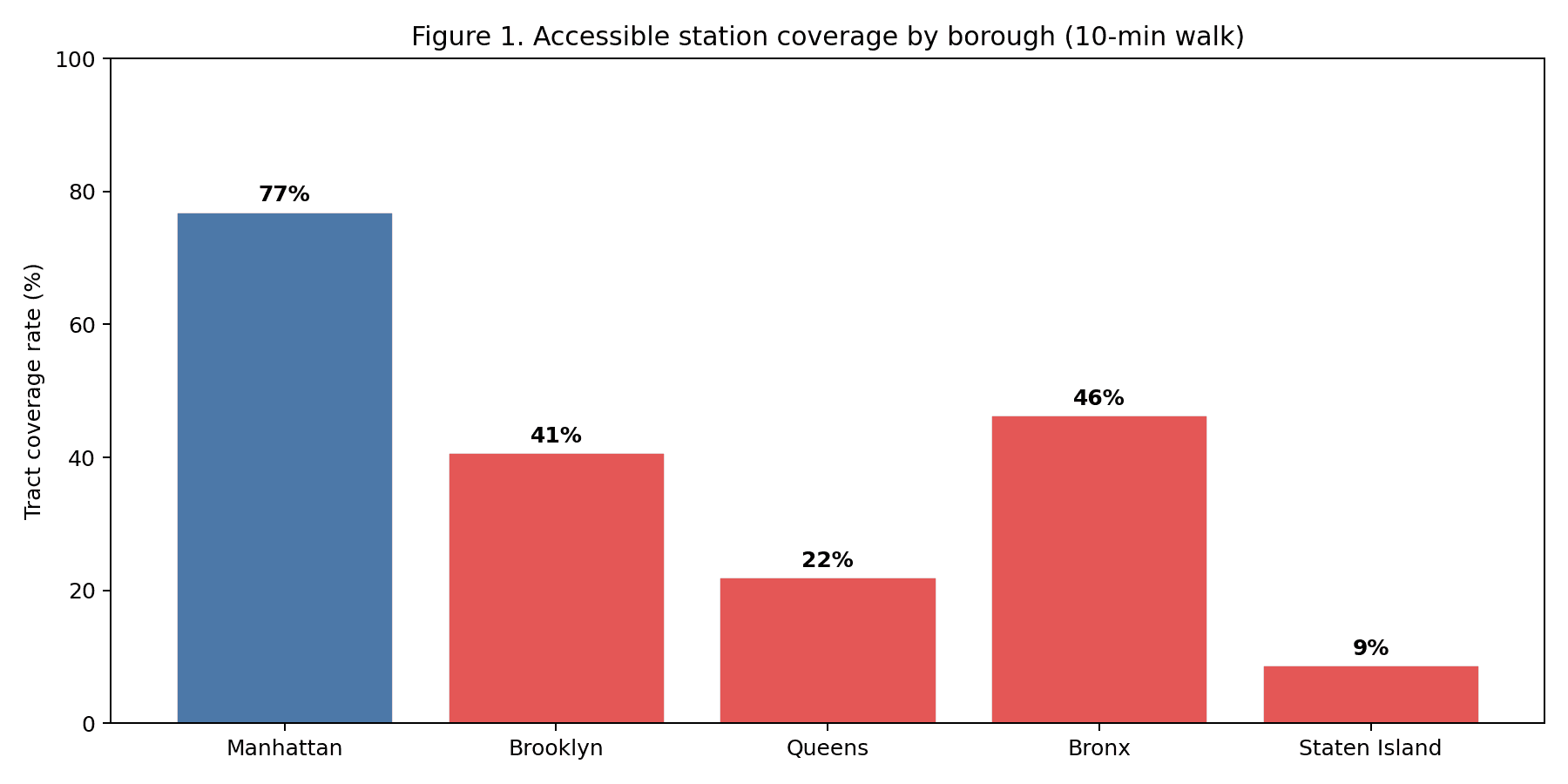
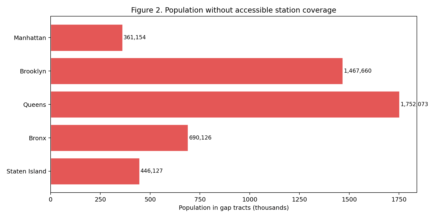
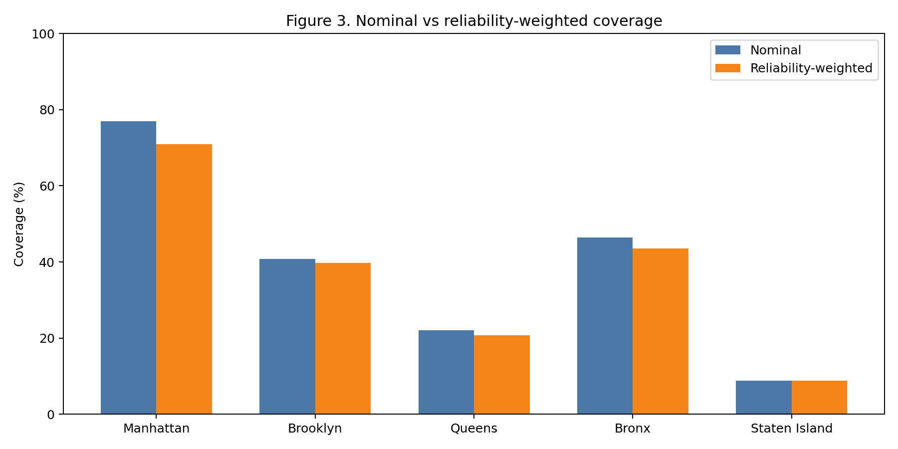
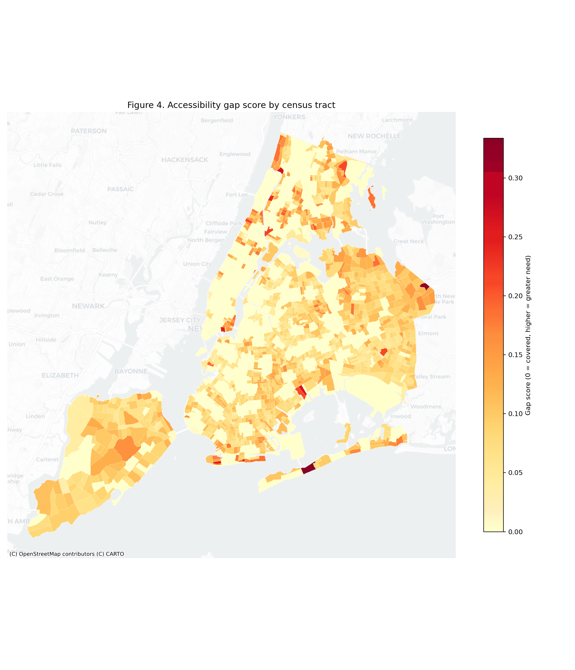
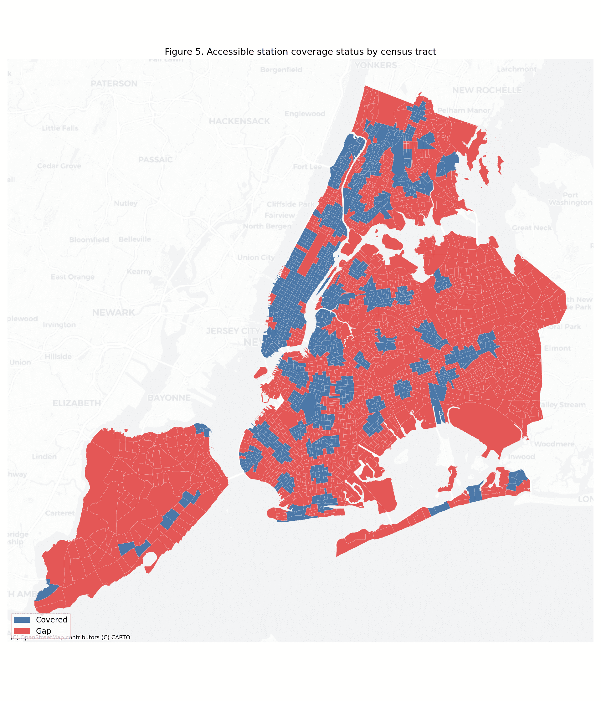
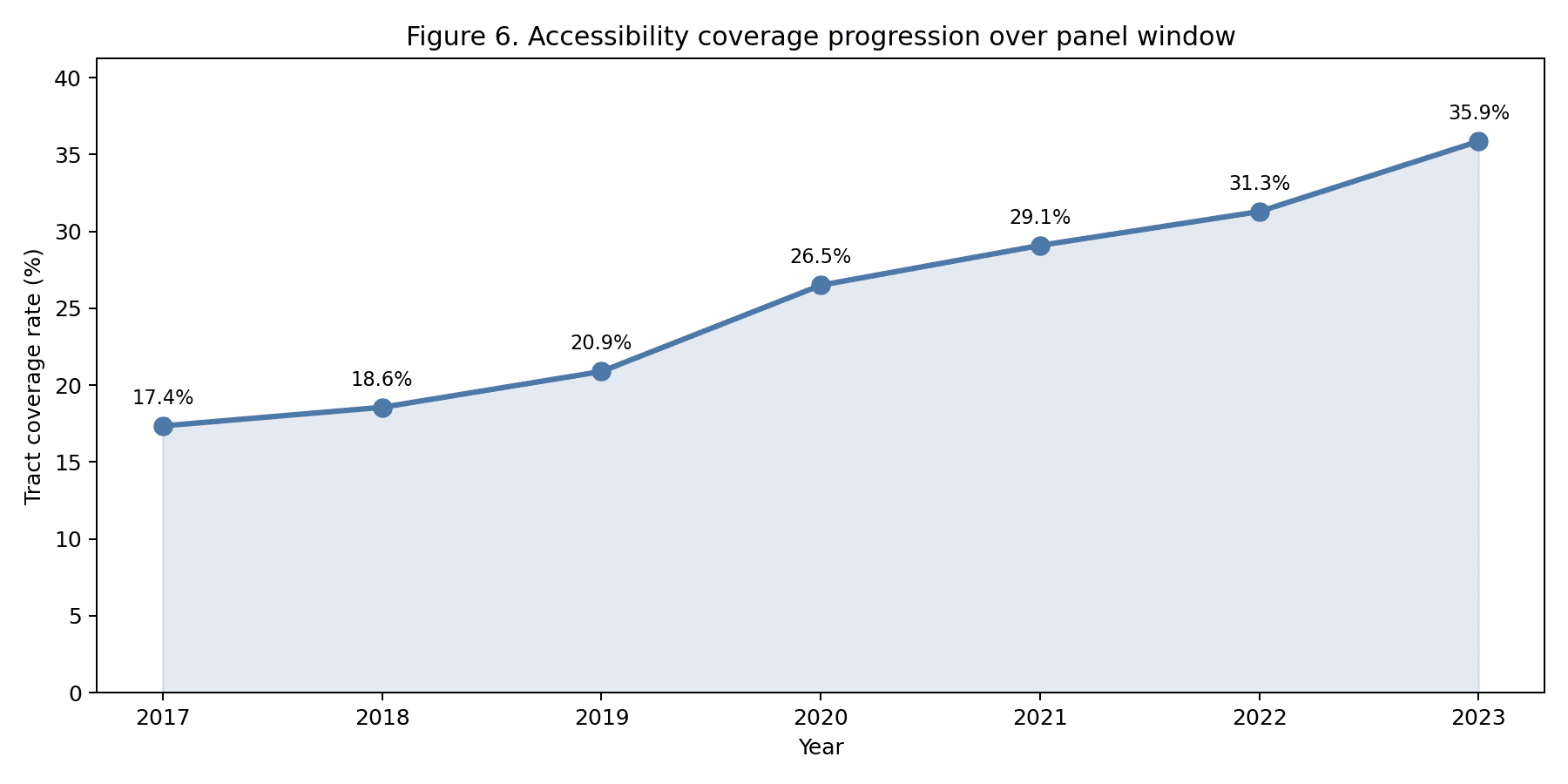
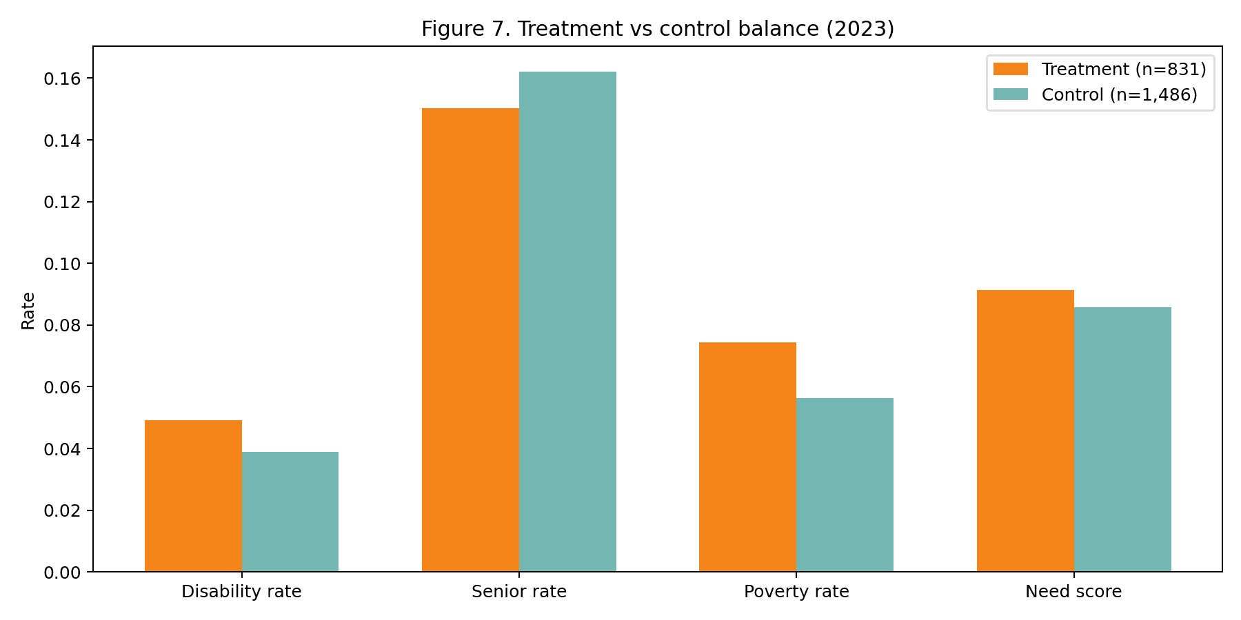
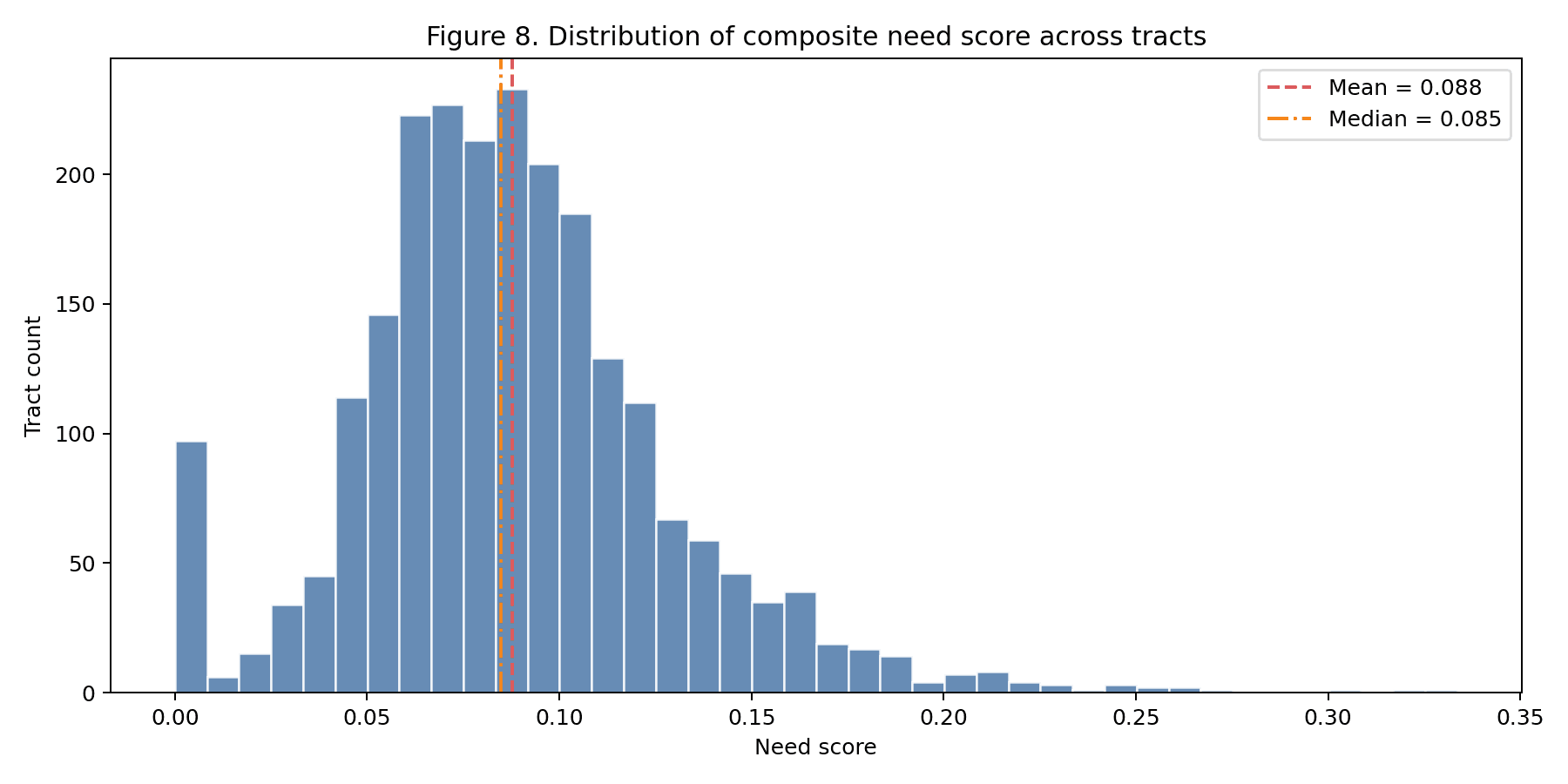
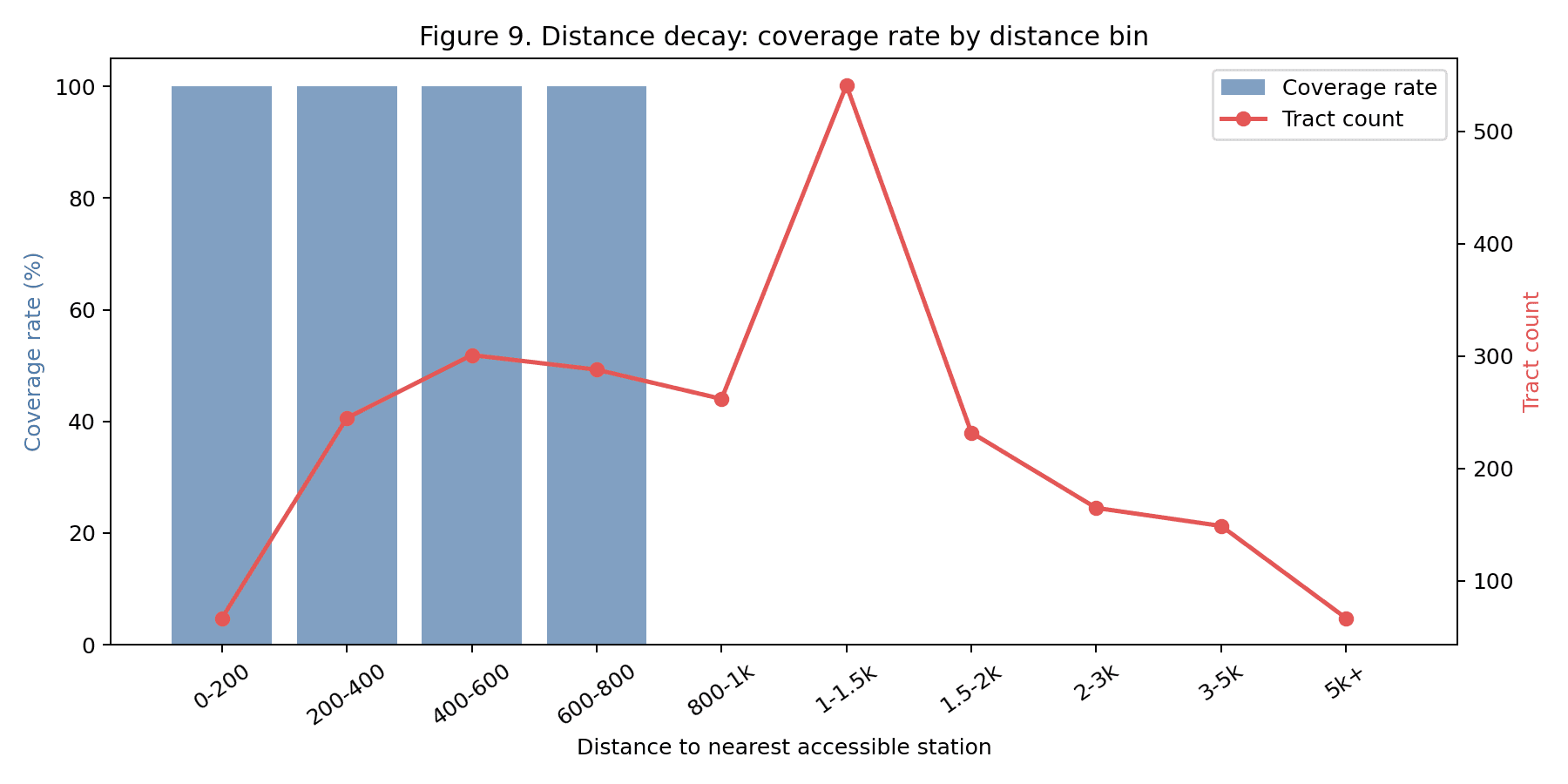
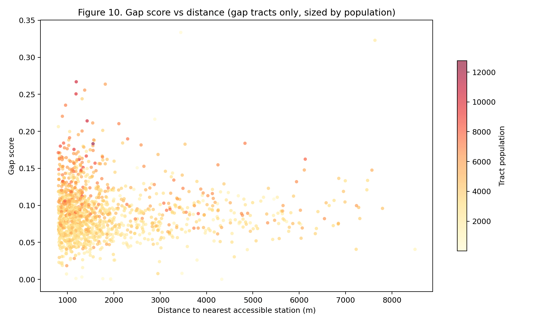
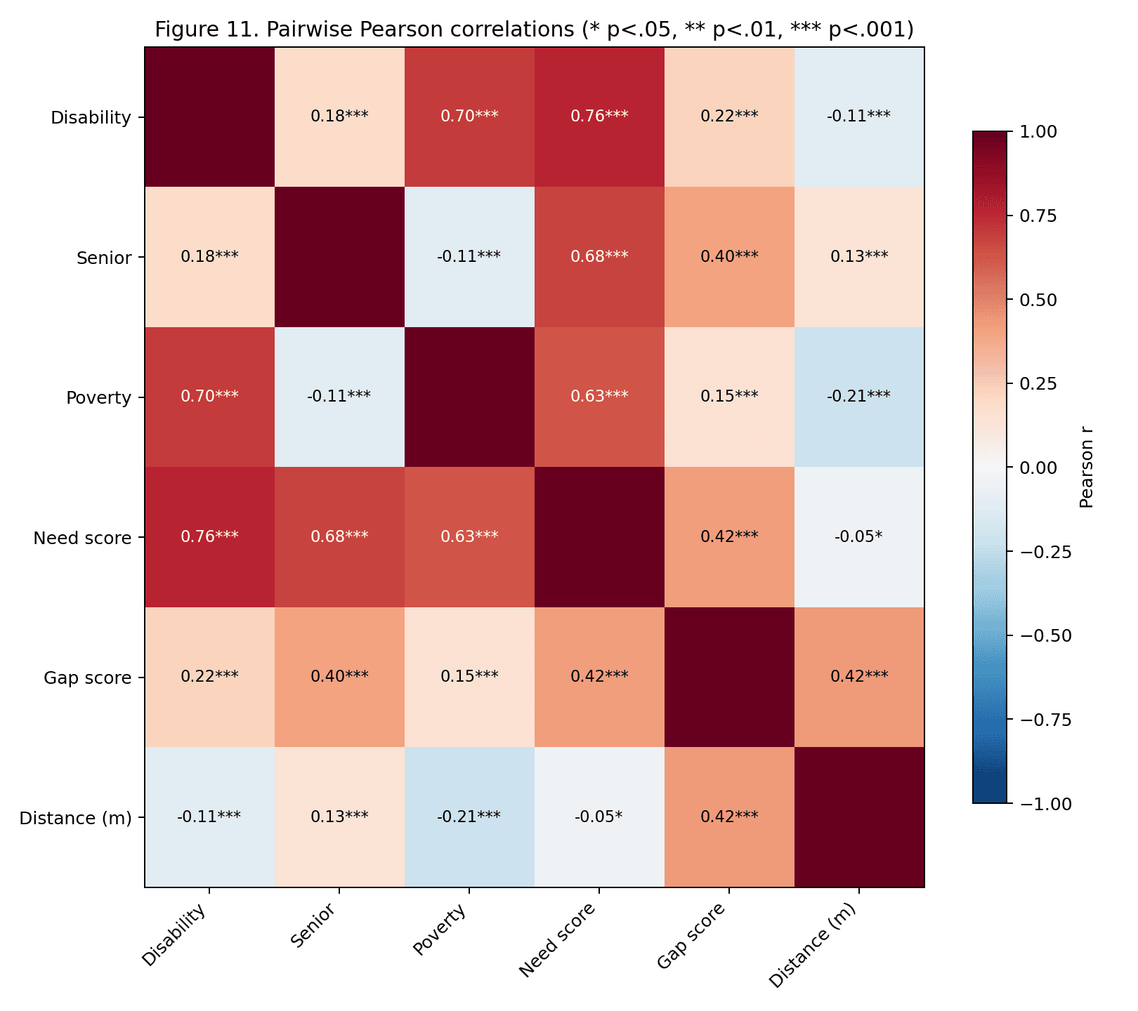
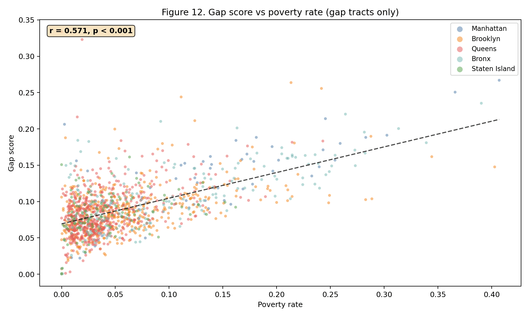
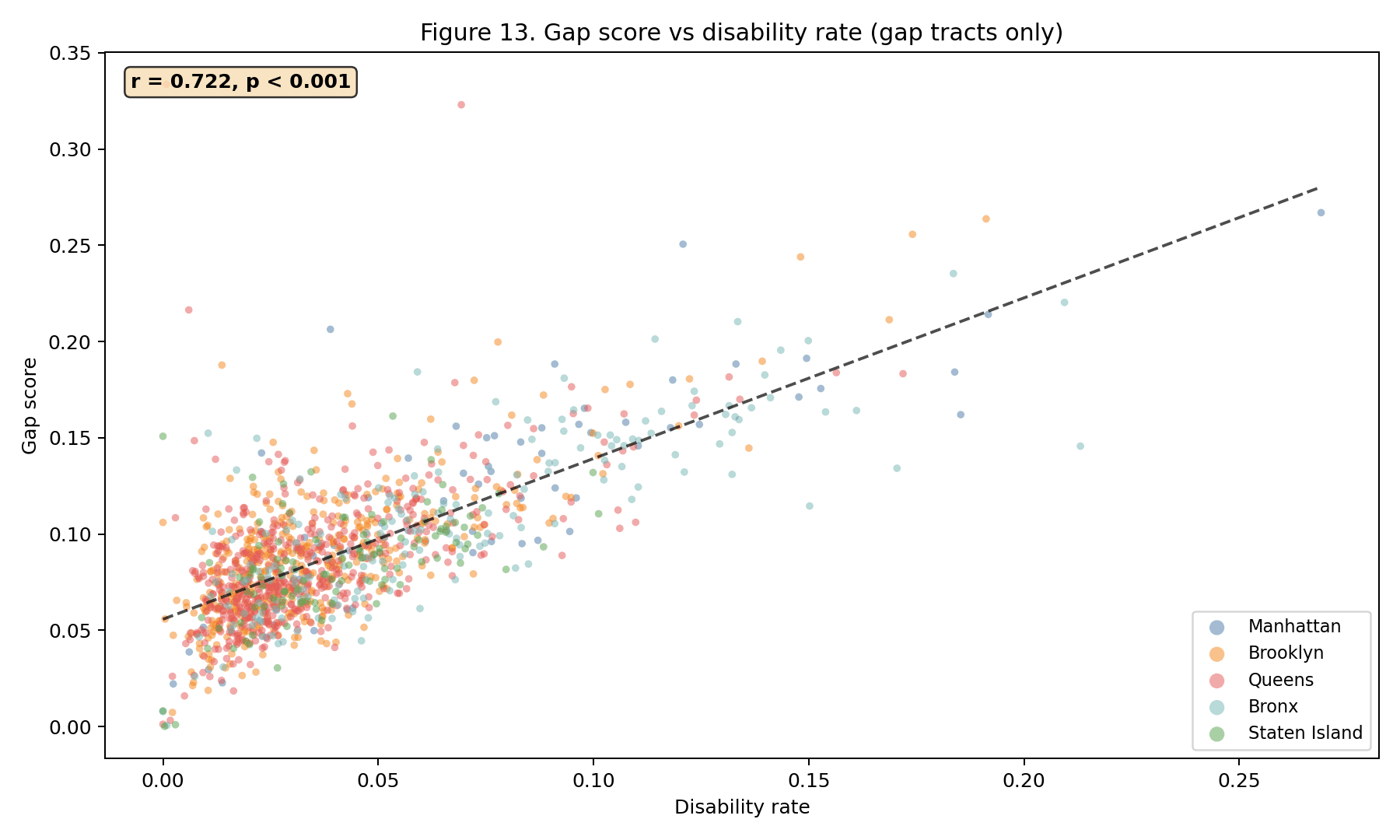
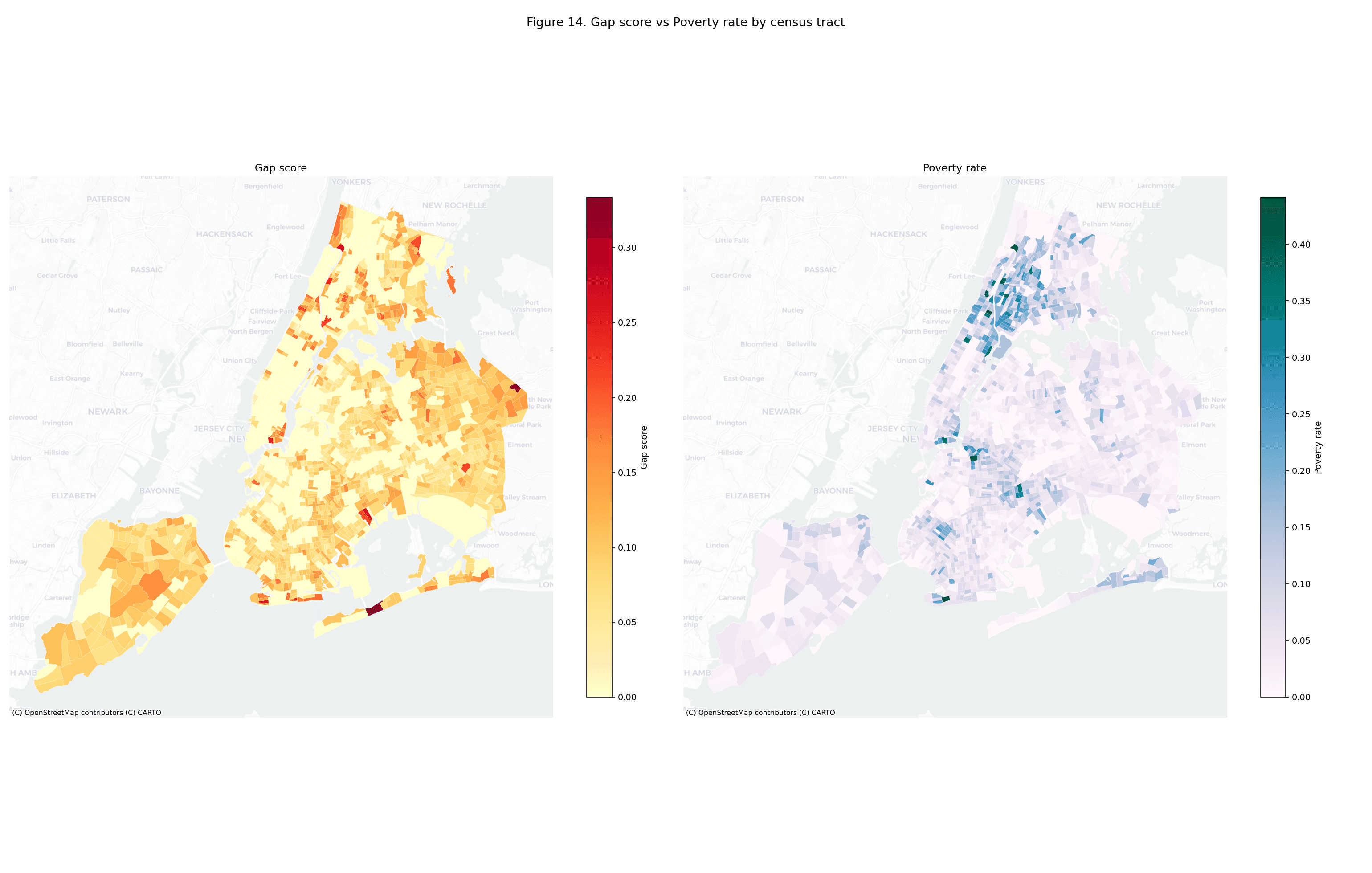
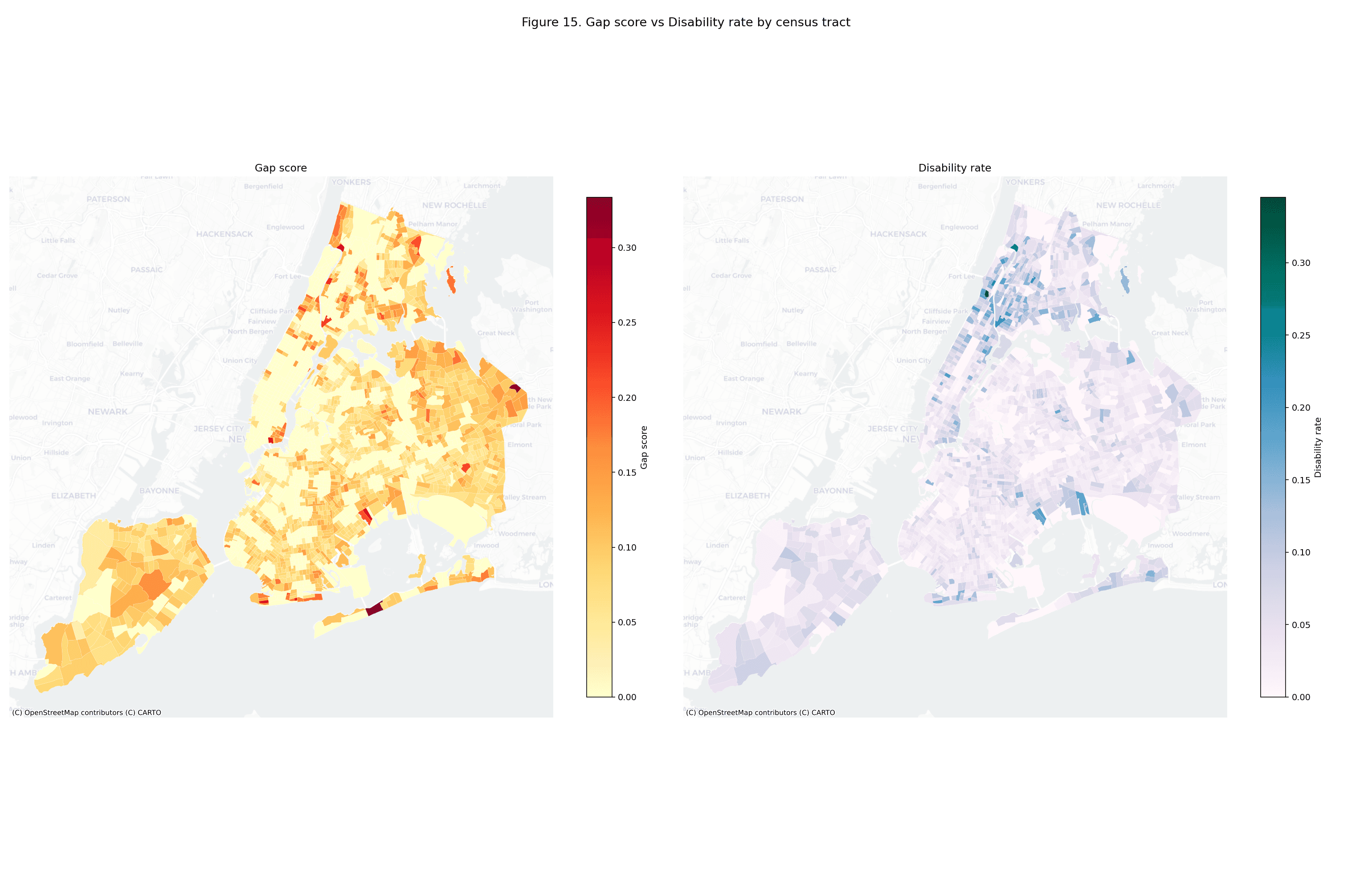
The cross-walk. Notebook 03 emits an 18-row table mapping each
upstream section to its factor-factory engine family (Random Walks, 2026) and the portfolio topic it illustrates. Table 1 reproduces it in
full; the structured version is published as artifacts/cross_walk.json.
The table is the distinctive contribution of this wrapper: it tells a
reader browsing the rat-containerization case study which other case
study to read next if they care about (say) spatial autocorrelation
(factor_factory.engines.spatial.morans_i, upstream CASESTUDY §4.8) or
vertical equity (factor_factory.engines.panel_reg.pyfixest_adapter,
upstream CASESTUDY §4.7). Sections without a dedicated estimator
(data sources, descriptive coverage, model diagnostics, discussion) are
marked with a dash in the engine column; the portfolio topic is still
populated because the methodological choice — how to write an honest
limitations section, how to communicate headline numbers — is itself a
portfolio-level concern.
Table 1. Cross-Walk From Upstream CASESTUDY Sections to factor-factory Engine Families and Portfolio Topics
| Upstream section | factor-factory engine family | Portfolio topic |
|---|---|---|
| §3.1 Data sources | — | Data provenance sidecars |
| §3.2 Accessibility model | nyc_geo_toolkit.catchment (spatial extra) | Walking-distance proxies and the network-distance upgrade path |
| §3.3 Need and gap scores | factor_factory.engines.inequality (composite indices) | Composite need indices and sensitivity to weighting |
| §3.4 Reliability-weighted coverage | factor_factory.tidy.Panel (reliability-weighted outcomes) | De jure vs. de facto service delivery |
| §3.5 DiD specification | factor_factory.engines.did.twfe | Staggered rollout treatment effects |
| §3.5 DiD — staggered adoption robustness | factor_factory.engines.did.{callaway_santanna,sun_abraham,borusyak_jaravel_spiess} | Cross-estimator agreement as identification check (Sun-Abraham is upstream's Appendix D robustness check; Callaway-Sant'Anna and Borusyak-Jaravel-Spiess are this wrapper's proposed engine mapping, not upstream content) |
| §3.5 SAR panel | factor_factory.engines.spatial.spatial_lag | Spatial spillovers and SUTVA violations |
| §3.6 Spatial analysis (weights matrix) | factor_factory.engines.spatial._base (weights) | Spatial weights construction and sensitivity |
| §4.1 System-wide coverage | — | Headline-number communication |
| §4.2 Borough disparities | factor_factory.engines.inequality.theil (between-borough decomposition) | Between-group vs. within-group inequality |
| §4.3 Reliability analysis | factor_factory.engines.changepoint.ruptures_adapter (uptime regime shifts) | Operational reliability as outcome |
| §4.4 Temporal progression | factor_factory.engines.stl.sktime_stl | Rollout curves and pre-trend inspection |
| §4.5 Treatment-control balance | factor_factory.engines.did._base (balance diagnostics) | Identifying assumptions — parallel trends, no anticipation |
| §4.6 Model diagnostics | — | Aggressive diagnostics |
| §4.7 OLS equity regression | factor_factory.engines.panel_reg.pyfixest_adapter | Vertical equity quantified |
| §4.8 Moran's I | factor_factory.engines.spatial.morans_i | Spatial autocorrelation as clustering evidence |
| §5 Discussion | — | Honest limitations |
| Appendix D — engine audit | factor_factory.engines.{did,scm,rdd,spatial} | Engine-audit-as-appendix pattern (directional agreement as check) |
Note. Section labels refer to the upstream CASESTUDY
(examples/accessibility-change-over-time/CASESTUDY.md in
random-walks/subway-access). A dash marks descriptive sections not
backed by a dedicated estimator. The structured version of this table is
published as artifacts/cross_walk.json.
The headline-numbers JSON. Seventeen quantitative fields — the
results the portfolio most often cites from the upstream CASESTUDY, from
station and tract counts to the OLS and Moran's statistics — are
emitted as structured JSON in artifacts/headline_numbers.json. This
lets the OSS catalogue and the portfolio index pull numbers without
regex-parsing the manuscript — which matters when the April 2026 vintage
gets bumped to a later MTA snapshot.
4. Limitations of the wrapper framing#
A thin wrapper inherits every limitation of the upstream analysis. The Euclidean 800 m catchment overstates true walking coverage because it ignores network topology. The ACS vintage is three years stale as of April 2026. The DiD timeline has sourced upgrade years for only 101 of 157 stations; the remaining 56 use a deterministic hash-based fallback pending a FOIL request to the MTA Key Station Program. The centroid-based coverage is a spatial simplification. Equal weighting of the need-score components is arbitrary. All of these are documented in §5.3 of the upstream CASESTUDY and should be read there rather than paraphrased here.
This wrapper adds one new limitation: the cross-walk is a curation, not
an engine audit. A real audit would re-estimate every primary result
using the named factor-factory engine and report the numerical
discrepancy. Appendix D of the upstream CASESTUDY does that for five
fits — TWFE and Sun-Abraham DiD, augmented SCM, RDD, and Moran's I —
but not for the headline OLS equity regression. Extending the audit
across every row of the cross-walk is future work; it belongs upstream
in the subway-access engine-audit appendix rather than here.
5. What happens next#
The upstream library is the evolution point. When subway-access v0.6
ships — with refreshed MTA data, a completed FOIL-sourced upgrade
timeline, or an expanded engine-audit appendix — this wrapper becomes a
bump commit: raise the subway-access pin in this repository's
pyproject.toml, replace the figures in artifacts/figures/, update
the headline-numbers JSON, re-render the catalogue. The cross-walk stays
largely stable because factor-factory engine names are API-stable
across minor versions.
For readers who want to run the live pipeline rather than browse the
snapshot, manuscripts/UPSTREAM_REFERENCE.md carries the clone +
uv sync + python main.py recipe. The output lands in reports/
under the upstream example directory; copy it back here to refresh the
wrapper.
References#
Albis-Burdige, B. (2026). subway-access: A Python toolkit for reproducible NYC subway accessibility analysis (Version 0.5.1) [Computer software]. Random Walks. https://github.com/random-walks/subway-access
Metropolitan Transportation Authority [MTA]. (2026). MTA subway station catalog and elevator/escalator availability. Open Data NY / Socrata. https://data.ny.gov
Random Walks. (2026). factor-factory: Protocol-based econometrics engine registry (Version 1.0.3) [Computer software]. https://github.com/random-walks/factor-factory
U.S. Census Bureau. (2024). American Community Survey 2019–2023 five-year estimates. https://www.census.gov/programs-surveys/acs
